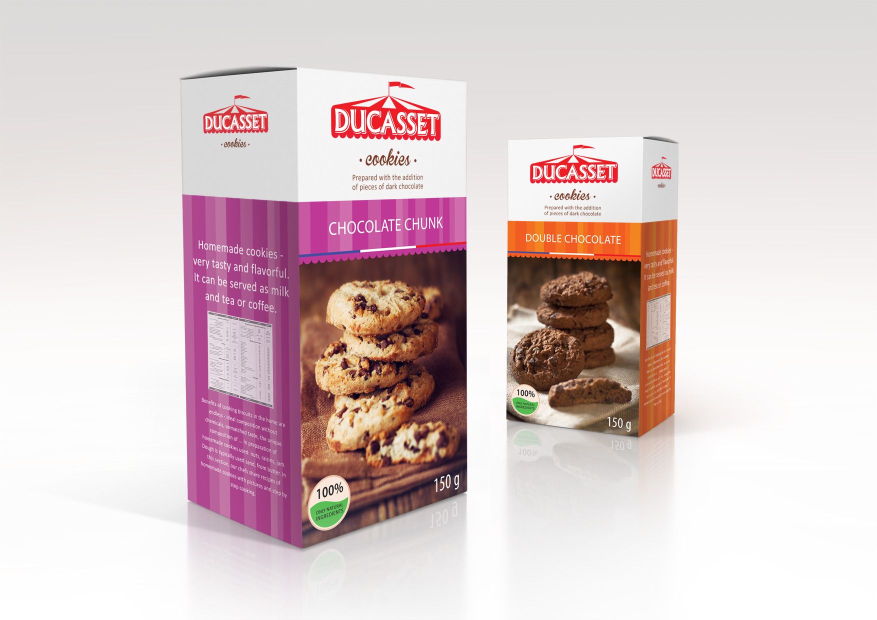
НЕЙМИНГ, ПОЗИЦИОНИРОВАНИЕ, ЛОГОТИП, ДИЗАЙН УПАКОВКИ
Ducasset- translated from French means “fair”. As you know, at the festive fairs there are always handmade sweets that are in great demand among visitors. The bright design of the packaging of cookies with elements of fairground attributes in the logo gives the product an emotional color and a festive atmosphere.
Creating a packaging design for cookies DUCASSET, we developed a logo, which depicts the dome of the carousel, which is a mandatory element of each fair. The separation of the design of biscuit packaging to tastes is due to the bright dies encircling the packaging in a circle. Thus, a consumer can easily find cookies on his shelf. In addition to the bright color code on each package there is an emotional food style.